

💰 How B2B Saas Companies Can Improve Monetisation from Stealing a Page from Mobile Games
💰 How B2B Saas Companies Can Improve Monetisation from Stealing a Page from Mobile Games
A sneak peek into a SaaS project I never released and my breakdown of the psychological principles behind my design choices

After a little hiatus stemming from a busy period at work I’m back and keen to dive back into the fun & sometimes scary world of monetisation.
Given the break I wanted to restart with a bang and thought I could be a little more vulnerable with a breakdown of a SaaS project I never released, a research platform for SaaS executives, and show all the psychological principles behind my design choices.
These were heavily inspired by the world of mobile games monetisation, who are probably the most advanced in terms of leveraging psychology to drive conversions but wanted to make a deliberate choice to not use any exploitative tactics.

It’s certainly more than a little scary given I’ve never shown this project to anyone and ultimately hard to share failures but hope this article can help a few people by showing some good parts and bad.
Step 1 - Reduce Barriers to Progression

My homepage was pretty simple, a title explaining the benefits and 5 sample articles that give visitors a much better sense of what the platform was about and enabled users to see the quality of the content.
There were no requirements to input your email address, your credit card or your job title - these first 5 articles were meant to just act as a hook.
Once a user did start viewing an article there were 2 major ways the page was unique in its structure, (1) instead of redirecting to a new page it would throw up an overlay helping users understand they could keep browsing the other sample articles, and (2) the CTA “Create Free Account” was super low stakes.
The reason for this was that while this platform had a paid element I wanted to lower the barriers to starting a free account and was a low stakes ask to continue to account setup.
Airbnb tested a similar change in their app last year and boosted their CTRs significantly when they changed a CTA to say “Review Booking” instead of “Continue”, which had users assuming that if they pressed “Continue'“ money would then be taken out of their account.
By making it clear they weren’t yet being asked to commit money just yet the progression to the next step of the user journey was massively improved.
Step 2 - Create a Sense of Personalisation & Progression

Next up was the actual onboarding. Whilst a lot of SaaS companies start with email addresses to try and capture as many leads as possible the inverse is actually best practice, you should be asking for info with the highest drop-off rates at the very end when they’ve built up a sense of time investment and thus a sunk cost (e.g. email & credit card info).
So I instead opted to ask questions that created a sense of personalisation and built progression. In the screenshot above you can see I ask what type of content they’re interested in, and provide increasing points for completing each step of onboarding.
The final step, and one that is sneakily important, is the fact it’s a multi-step lead form which clearly shows your progress. What exactly are multi-step forms?
“A multi-step form is a long form that is broken into multiple pieces. They’re used to make long forms, such as shipping or registration forms, less intimidating and daunting. By allowing customers and leads to complete their information in smaller chunks, you create a positive user experience and increase conversions.”
Here’s an interesting article on the difference implementing a multi-step form has on conversions.
Then, the next screen asks for them to search for competitors they’d like to follow.
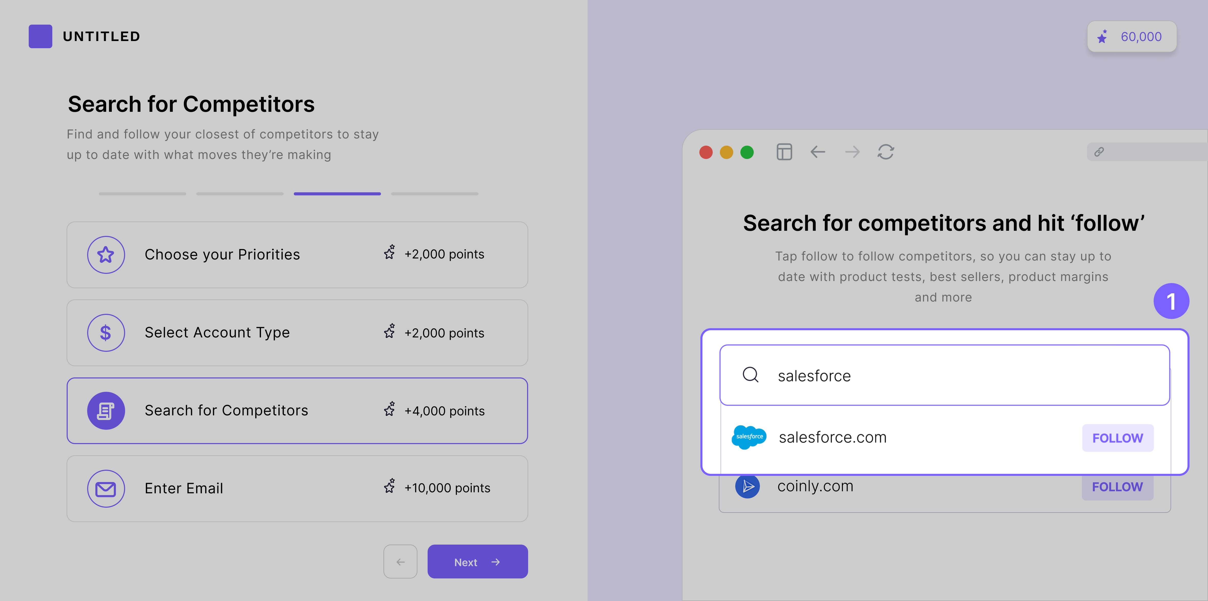
This is the ‘Ikea Effect’ in action, the principle we value things we put work into more highly.
Whilst Ikea may not use the best materials or joining we develop a real sense of attachment to the Swedish furniture because when we see it in our homes we vividly remember the work it took to construct it.
Whilst it does indeed do a great job of building attachment, in the case of SaaS it also vastly improves the utility of the app. If we know the companies you’re interested in snooping on then it’s a lot easier to make the right type of content.
Mobile games really heavily utilise this, making you form a deeper connection with the game by enabling you to customise your character through skins & items. Below is an example of Fortnite where you can choose your character skin, back bling, pickaxe, glider, contrail, dance music, weapon wraps and more!

Step 3 - Anchor the Price Artificially High
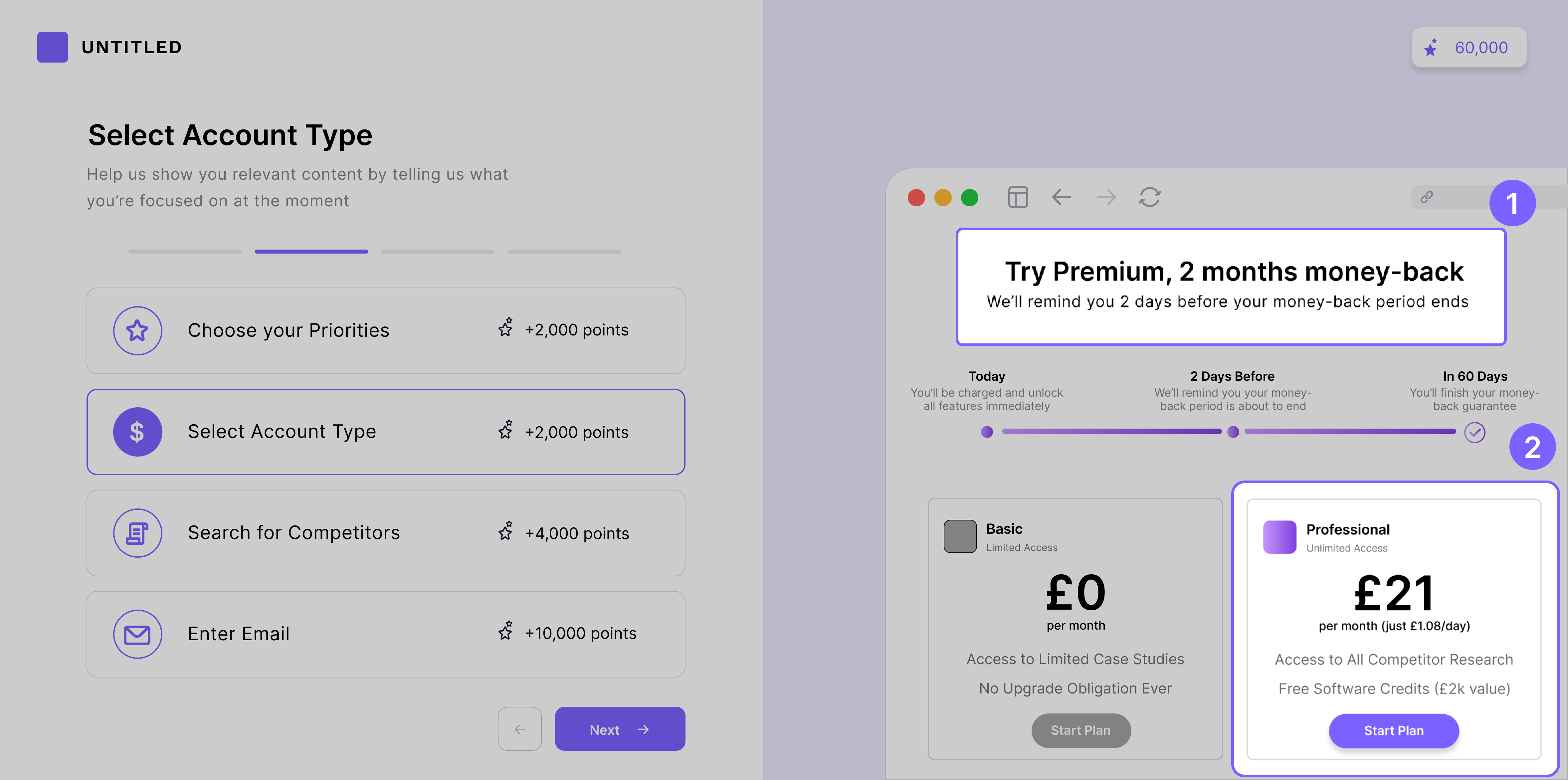
Now, this is possibly the most important screen. The first thing you’ll see is copy letting users know they’ll receive a reminder before the trial period is over to incentivise people to try out the premium content, inspired by Blinkist’s paywall (more below).

And whilst it’s the first time a user will see an option to purchase the premium plan, this screen isn’t designed to make users convert to premium.
What?
I’m not naïve - I can’t realistically expect users to read a single article on the homepage and be willing to shell out $27/month given the abundance of great free written content.
Mobile games have a very similar problem. 98% of people go into free mobile games under the premise they won’t spend any money and so developers need to break down that wall and start getting users thinking of themselves as spenders.
The main way this is achieved is with anchoring. It’s the idea that it’s super hard to intuitively understand the value of something digital and so the first price we hear becomes our anchor, of which we’ll compare everything going forward against.
That is what this screen is intended to do, set the anchor artificially high where users perceive the value of this content at $27/month (whilst I hope that the content I was writing reflected that value I understood most people wouldn’t convert at that price).
Step 4 - Get the First Spend
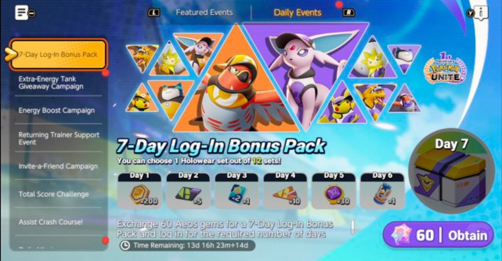
After this is where the real conversion tactics come in. Below is an example from Pokemon’s mobile game, where after their first battle (& just 6 mins after their first paywall screen) users will see a bundle offer with a 90% discount, which makes users feel it’s too good to pass up, costing just $1.
The screen you see below is my version of incentivising the first spend. Whilst it’s not perfect (ideally you make this a lower commitment decision by asking for $1) it leverages the same idea - you’ll get 65% off an annual plan and a 2 week trial which has a money back guarantee.

Perhaps this may have been better as a paywall shown after 1 month, once users have built an affinity for the content? It’s a little premature to ask someone to commit to a 1-year relationship on your first/second date, SaaS is no different.
Despite the poor timing one positive thing to take away is the action, you should be doing everything you can to convert your users to an annual plan, even one as dramatic as 60-65%.
Benefits of Annual Plan Paywall:
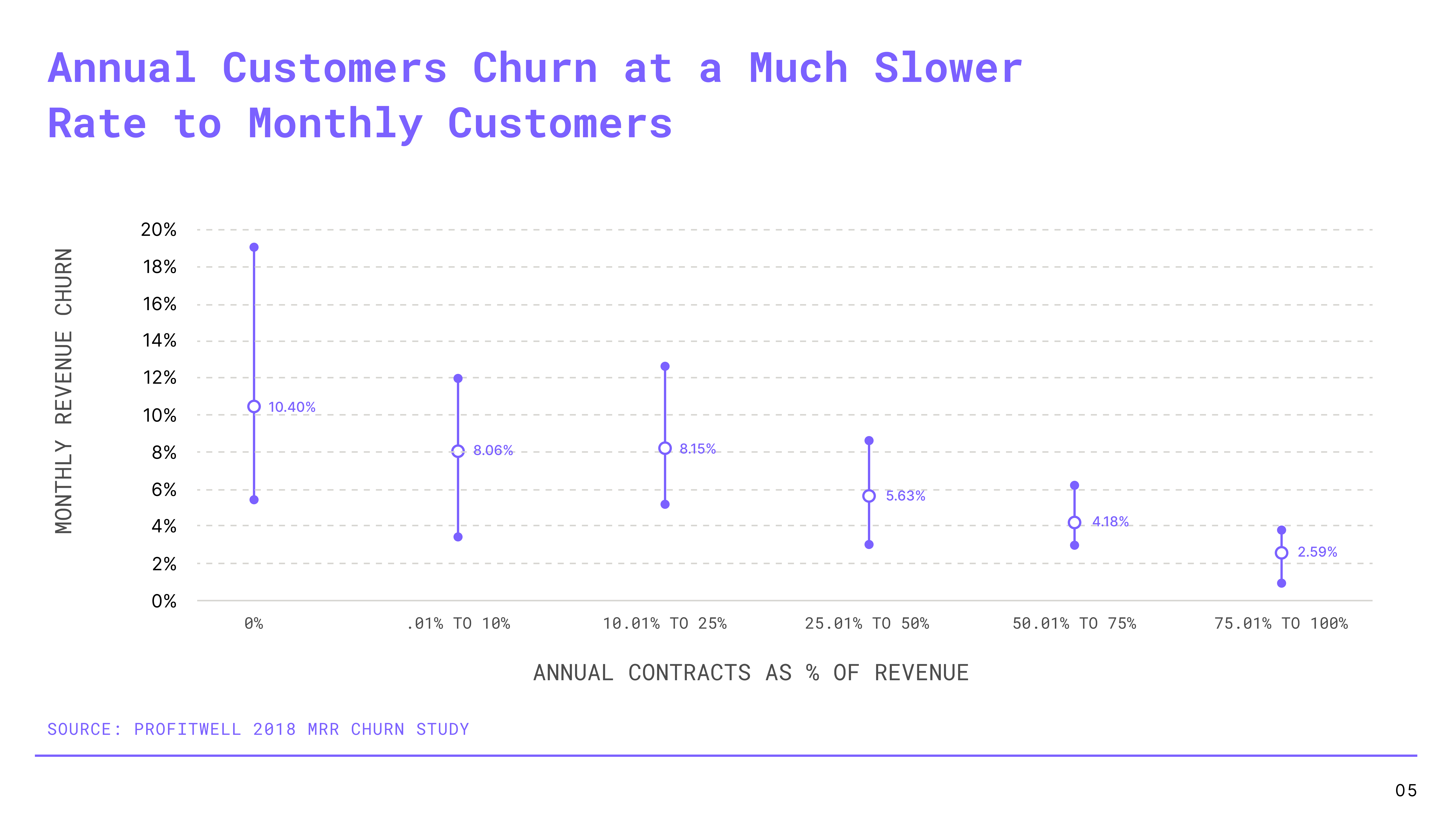
Greatly reduces churn
Improves upfront cashflow enabling you to reinvest capital back into the business for faster user growth
Means you don’t need to force an annual plan on the paywall. This puts a large % of users off because they don’t yet have a proper appreciation for your value and means you never get them into the funnel
That’s it for today folks. If you enjoyed today’s article I’d really appreciate any new readers subscribing - it’s totally free and it means you won’t miss next week’s article.