
How Blinkist’s New Paywall Drove a 1,200% Increase in Notification Opt-In Rate
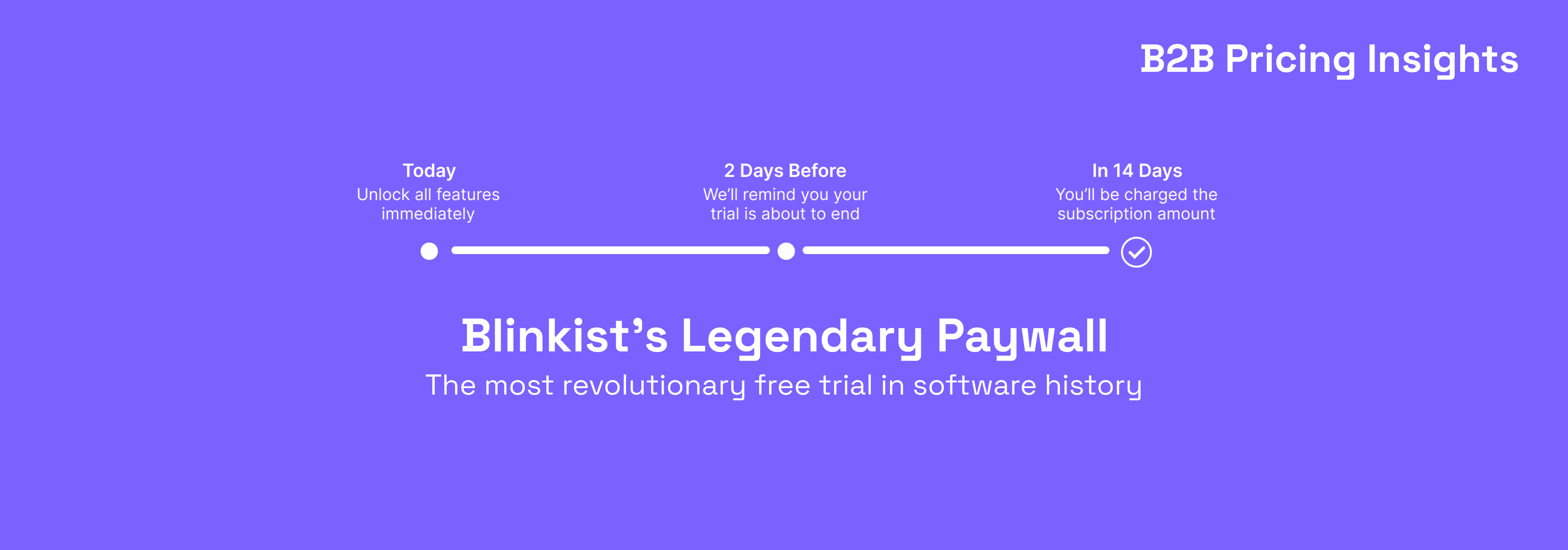
The most revolutionary free trial in software history

After a long hiatus this is our second post back covering B2B price & monetisation. After last week’s post I received a question from a startup founder asking how they could improve their paywall. I immediately referred them to the Blinkist paywall case study but thought it would also be a great case study to cover here.
So today, we’re looking at that Blinkist paywall which led to a 1,200% increase in notification opt-in rates (6%->74%), 23% more trial sign ups, 55% fewer customer complaints, and 4% higher trial retention!
In the next four minutes I’m going to teach you:
Who Blinkist are
How did they change their paywall?
What Blinkist’s onboarding gets right
How to improve
Who are Blinkist?
Blinkist was founded in 2007 Germany, by 4 co-founders hoping to make an aspirational activity, frequent reading, an easy habit. Blinkist is now the largest book summarisation app in the world, offering 15-minute summaries to a staggering 23 million members.
To monetise Blinkist rely on a freemium product offering, boasting unlimited access to 6,500+ top titles and access to their latest product, Blinkist Guides, providing deep dives on current events.
However, whilst Blinkist have always excelled in user acquisition monetising a free user base is a notoriously difficult challenge, one they decided to tackle with a complete redesign of their paywall, and a considerable deviation away from industry best practices.
How did they change their paywall?
In their quest to boost free trial sign ups they recognised the significance of the industry’s shady practices, relying on people forgetting they had started a trial and continuing to pay indefinitely which had led to trial fatigue.
To counter this Blinkist came up with a new concept, one that clearly explained how their trial worked, and importantly, that they would receive a reminder 2 days before their trial ended so they were sure not to forgot to cancel.
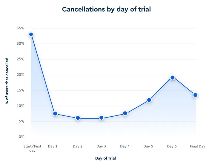
Whilst it may seem counterintuitive to help people cancel, in general, they’ll still churn if that’s their intent. It may be after a few unwanted payments but it’s also why Blinkist saw that 33% of all cancellations were happening on Day Zero, right after users started their trial.
Instead, this test built trust and benefitted the company in 2 major ways:
It gave Blinkist time to demonstrate their value in the 5 days before users receive the notification and,
This paywall creates a genuine need for users to opt-in to push notifications, thus earning the right to increase the number of messages they can push to users, greatly increasing the likelihood of a user upgrading.
There’s countless reasons why a user may not be ready to convert to a trial today; they may need more time to think about it, worries about forgetting to cancel, subscription fatigue, price sensitivity, or they may just not have budget right now. By building a 7, 14, or 30 day notification flow you can hit users when they may be more willing to take the leap.
What Blinkist’s onboarding gets right
So, let’s dive a little deeper to understand what makes this paywall, & Blinkist’s broader onboarding flow so effective.
When a user first downloads your app they don’t have a load of effort they’re willing to expend. This is where Blinkist do something smart, by asking for low value information about reading preferences Blinkist start to leverage the ‘sunk cost fallacy’, the idea people make decisions based on the effort they've already invested, rather than considering what's best for the future.
By getting this information first and leaving any screens with high drop-off rates (e.g. paywall or contact info) until the end of onboarding you help users build a real sense of ownership of their future Blinkist collection.
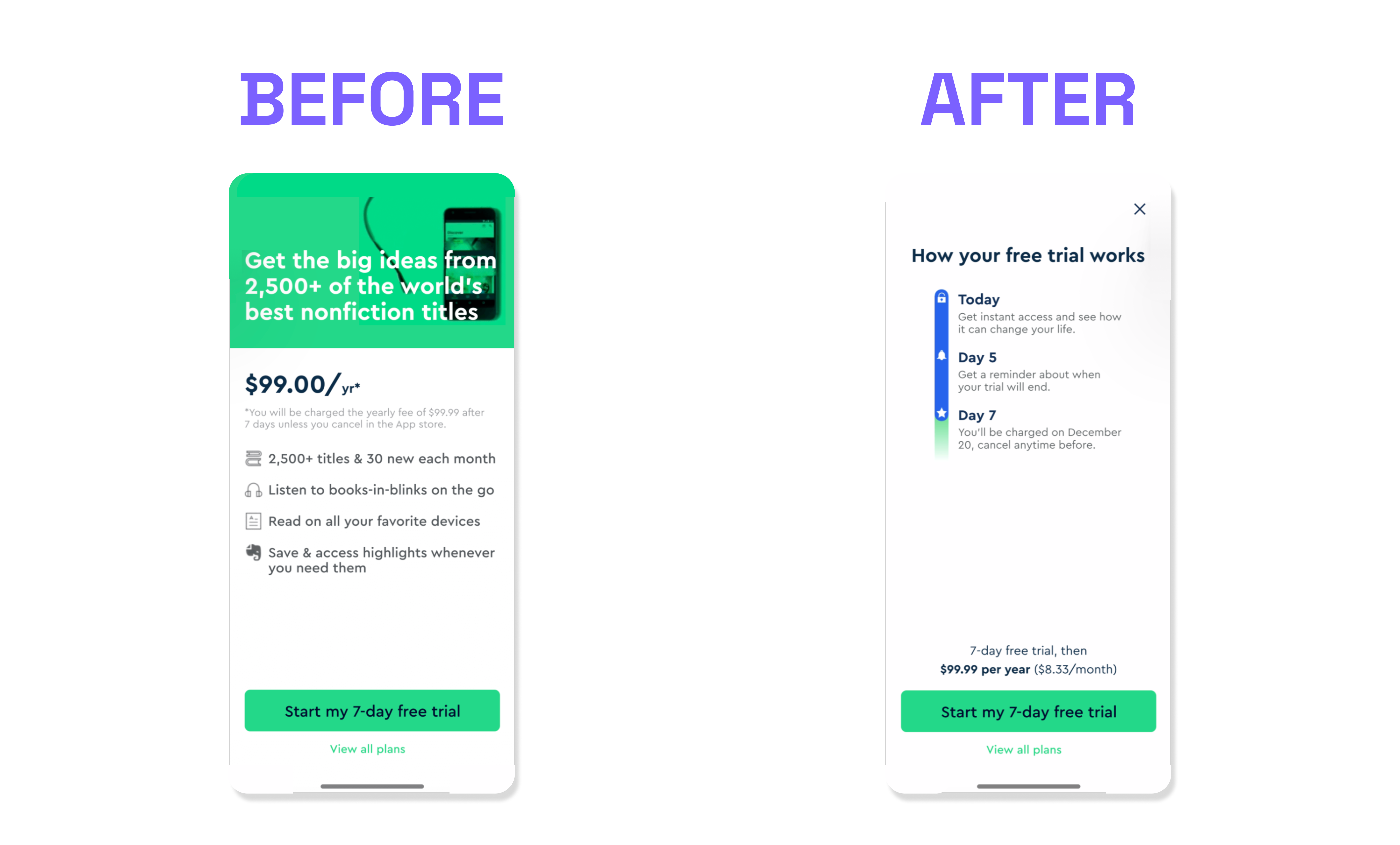
Once users do finally get to the paywall there’s a lot to like. Aside from effectively calming a user’s nerves, something consumer’s have never seen before, they really drive this point home. Instead of focusing on hopes & desires like most products (i.e. by listing the benefits of a subscription) they highlight the avoidance of fear around wasting hard-earned money on a forgotten, and unused subscription, tapping into people’s loss aversion.
They follow up this paywall with the main secret of monetisation, keep showing that paywall! Blinkist have a pretty aggressive notification flow in an attempt to get users coming back to the app (& therefore gaining more value) leveraging both content related notifications like book recommendations and steadily increasing offers.
On Day 3 comes a 50% discount, on Day 6 users are presented with 60% off, and on Day 7 they present their best & final offer, 75% of their annual plan taking Blinkist Premium from £60 to only £14.99. This is a smart move by their team, increasing the discount over time is a great way to get incremental trials & subscribers whilst not reducing profitability of users willing to upgrade at/nearer full price.
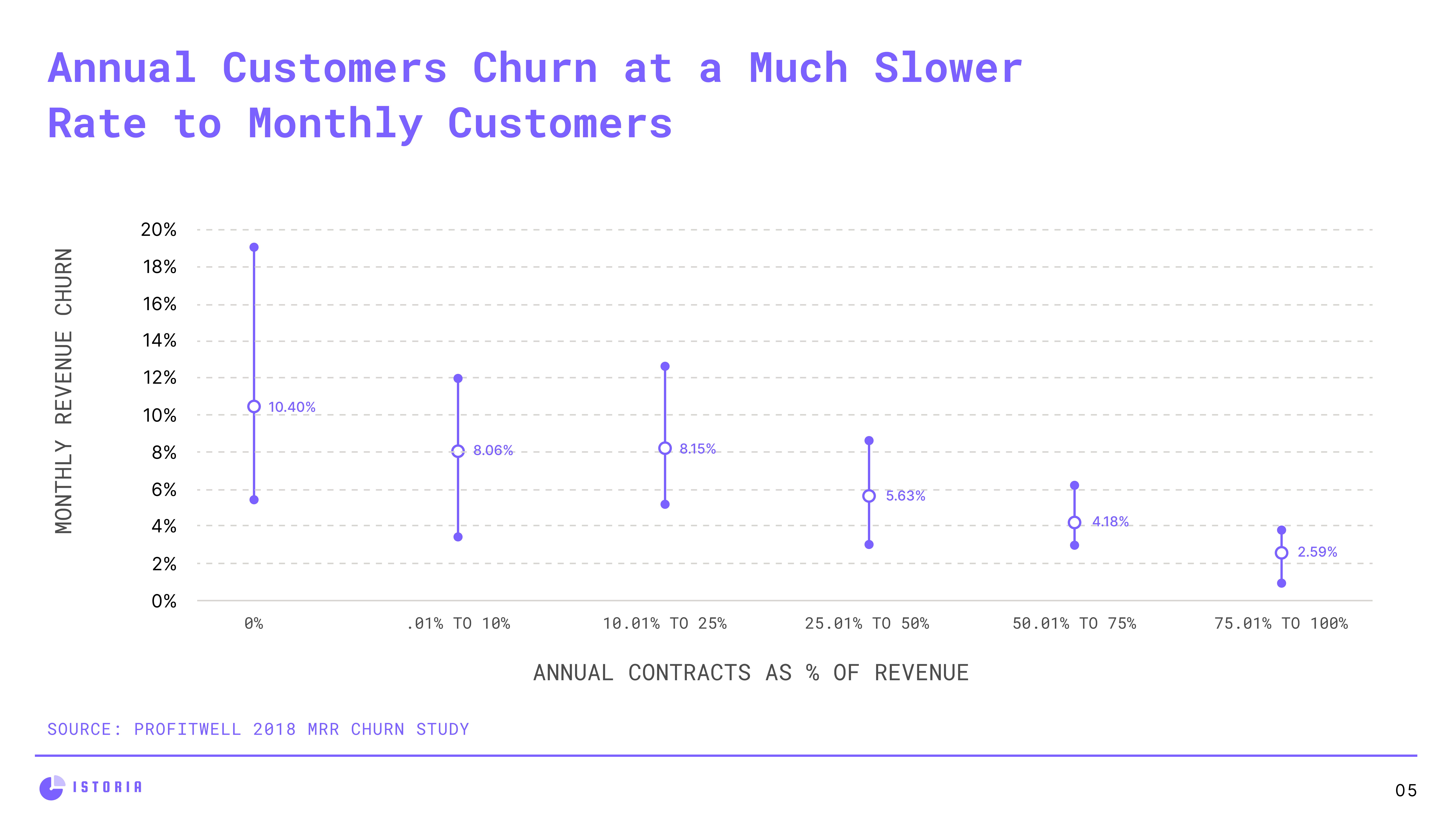
Whilst it is a great offer and Blinkist likely do get pretty decent engagement on this, they are most certainly attracting the worst, most price-sensitive cohort of users who are highly likely to churn down the line. But on the plus side, the company does a great job at mitigating this by only offering the 75% discount on annual plans which have much lower churn rates and enables Blinkist to build a meaningful habit with users.
How to Improve
Now, onto the fun stuff - how could Blinkist improve? Whilst their paywall is brilliant, both from a business and user experience perspective there are still, of course, some areas they could be doing a better job in:
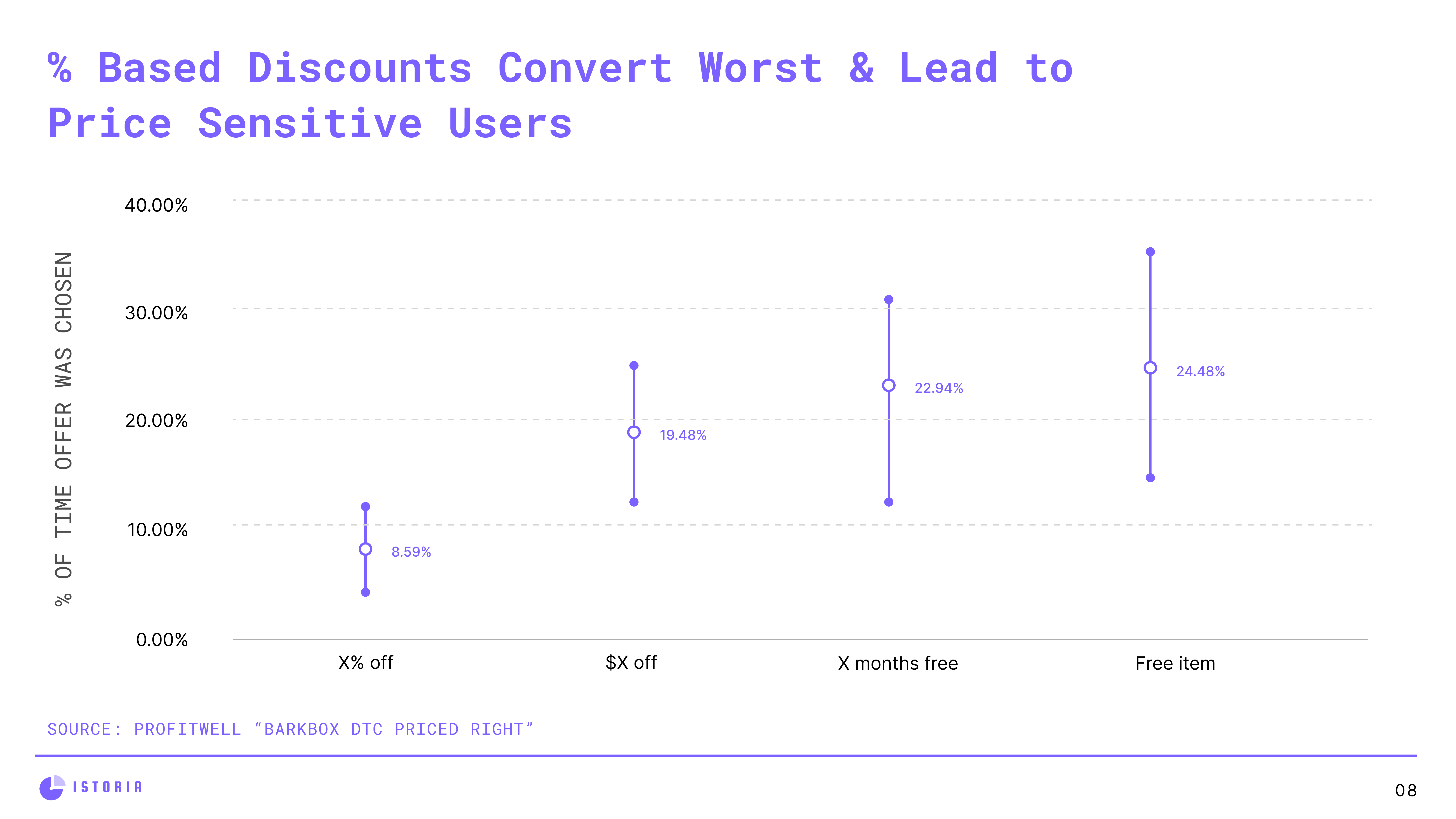
Offer month based discounts vs % discounts
As humans we don’t like maths. The reason this matters is that because when evaluating how good a deal something is a %-based discount is far less tangible than offering dollars or months off, or a free item.
This leads to fascinating data that shows that free item incentives (e.g. buy this annual plan & get X free item) and get 10 months free on your annual plan are the single greatest ways to get people converting.
Advice for Blinkist? Test both of these value props - offering a compelling free item will not only increase conversions but will drastically increase profitability by keeping the annual plan at the original price (& chucking in something like Blinkist Guides for free).
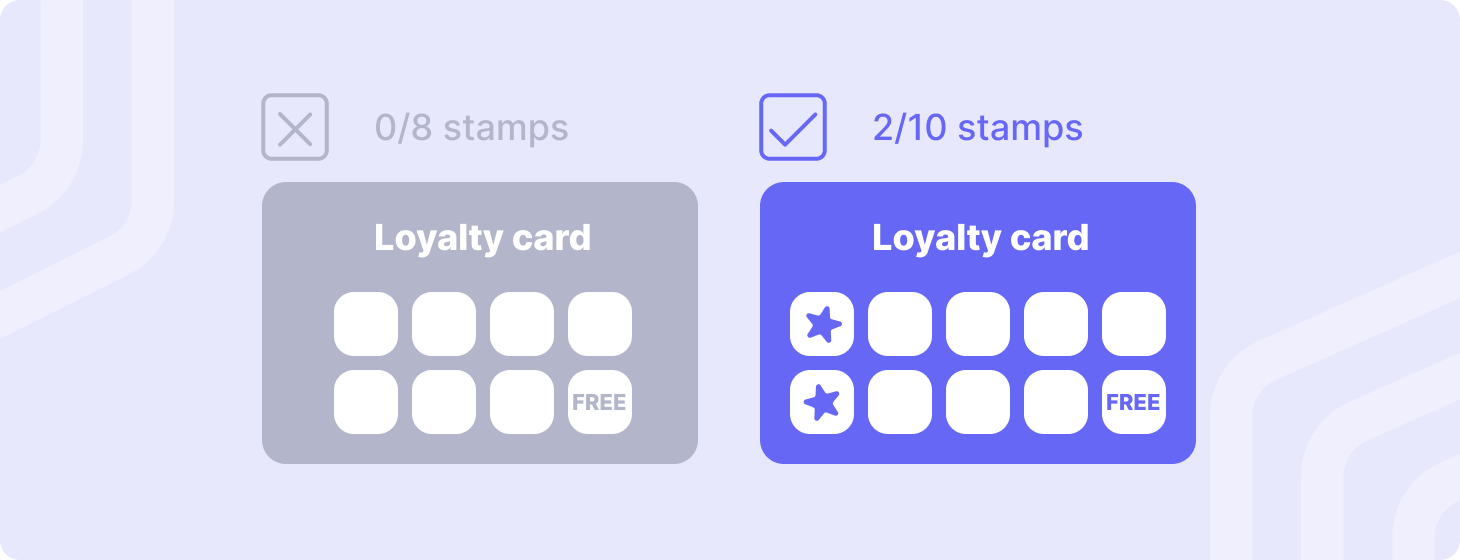
2. Leverage the Goal-Gradient Effect on Paywall Screen
What the hell is the goal-gradient effect? It’s the idea that motivation increases as users get closer to their goal and was discovered when scientists (Kivertz, Urminsky & Zheng - 2006) launched a popular experiment showing that a 10-stamp loyalty card pre-stamped twice got completed significantly faster than an 8-stamp card with no progress initially.
You’ll see this leveraged a whole lot in software where you’ve already “completed” 25% of a survey as soon as you enter making you feel like you may as well just finish the rest. Advice to Blinkist? When users are shown the paywall, have the first step shown as completed (e.g. all their personalisation and reading preferences).
3. Clearer Titles on Paywall Screen
Double down on what made that paywall special and ease user’s concerns. Only 16% of users actually read the text on screen, revisit that paywall and design it to be super clear about the benefits. Instead of explaining they’ll get a notification on Day 5 in small grey text, reword the headline steps to make it super obvious. Users are lazy, make it easy for them!

That’s it for today folks, if you enjoyed today’s newsletter and are interested in best practices around B2B Software Pricing a subscription would be greatly appreciated!
Great analysis & case study, thank you for sharing! I admit I’ve been a victim of the goal gradient effect.