


Redesigning Gemini’s Pricing
4 Psychology-Backed Tips to Increase ARPU

This isn't just about making aesthetic improvements, it's about using data and behavioral psychology to drive higher conversion rates and maximize revenue per site visit.
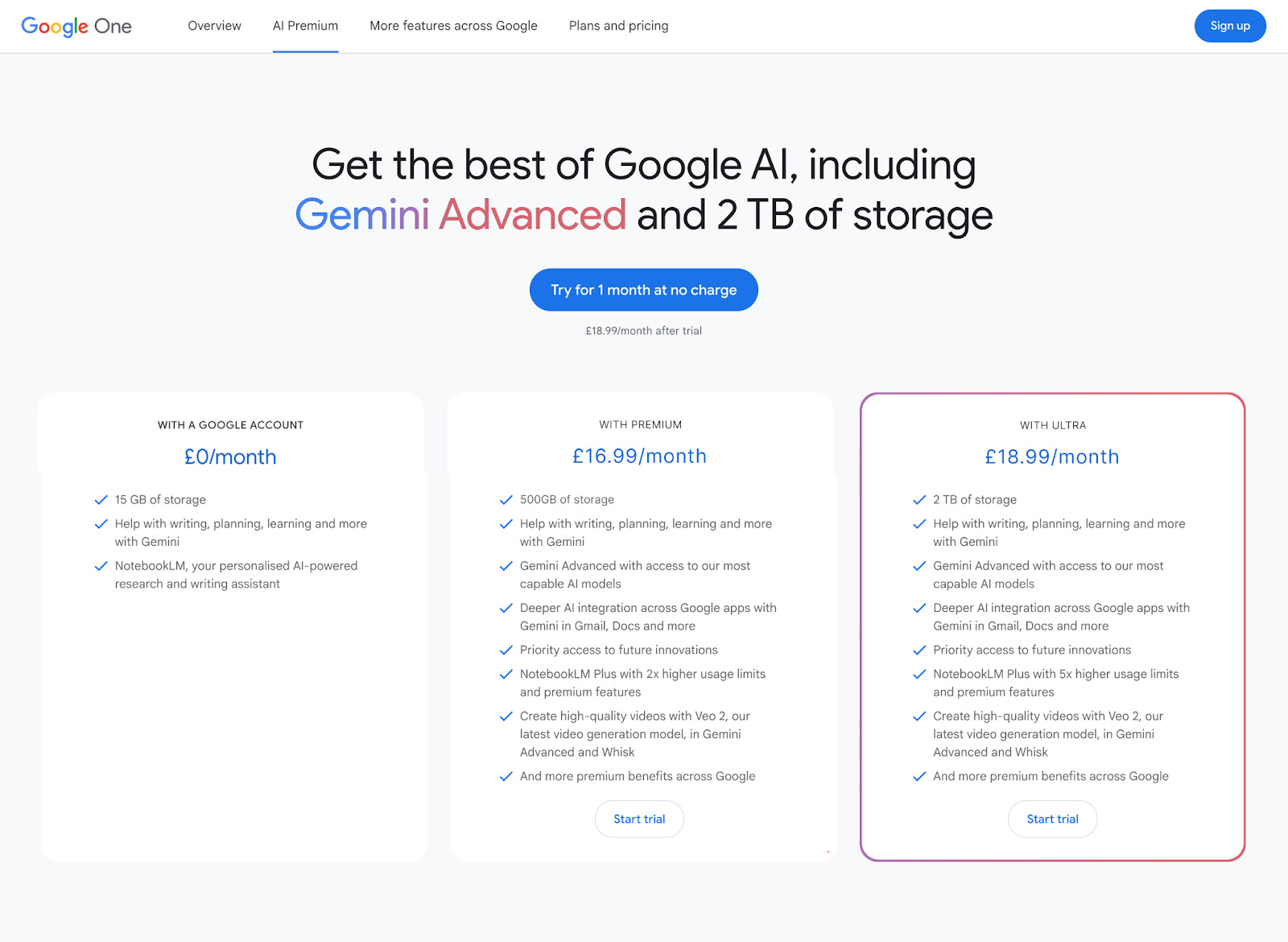
Breaking Down AI Studio’s Current Pricing Page
First, let’s analyse what’s good about the current pricing page:
✅ Only 1 Coloured Button: The only coloured button on the whole page is the trial button. This means all user attention is drawn to what we want it to, reducing distractions.

✅ CTA Above the Fold: Another nice little conversion booster. Consumers are lazy and so if they can’t immediately see how to subscribe they sometimes struggle to understand how to upgrade.
But no pricing page can be perfect, so let’s dig in to some things that could be improved.
Weaknesses of Google’s Pricing Page
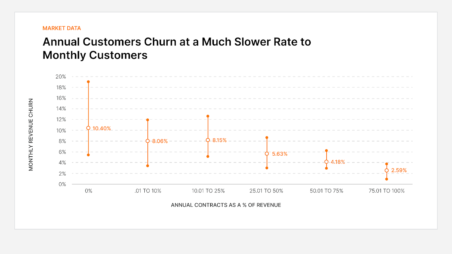
❌ No Annual Plan: Retention for consumer AI products is a weakness, and given the competition from OpenAI, Claude and Grok releasing new updates on a weekly basis Gemini likely see some amount of churn.
An annual plan is a quick way to reduce some churn, giving consumers fewer opportunities to cancel whilst simultaneously giving them more time to build habits with Google vs competitors and learn how to best use the product.
❌ No Second Pricing Tier: There’s a large group of users who may be willing and able to pay more than $20/month for more usage.
This means Google isn’t properly monetising some of its more valuable consumers.
Option 1 would be to add the ability to purchase additional credits.
See Windsurf IDE as an example:

Option 2 might be to introduce a power user tier similar to OpenAI.
❌ No Social Proof: There’s a reason why every SaaS company shows which companies use their product, it builds credibility and drives FOMO. Whilst on the consumer pricing you may not be able to use logos you can still show the number of people who have subscribed.
Here’s the research:
‘156 views’ had a +30% effect on purchase intent
‘390 bought’ gave a +53.5% boost in purchase intent
❌ Generic Headline: Whilst not a huge redflag the headline ‘Get the best of Google AI’ is pretty weak, doing little to reinforce the value.
Other ways it can be improved is by tailoring it to the user. Have they used their allotted Deep Research requests? Then say Upgrade to unlock 20x more Deep Research Requests per Month.
So with all this in mind how could we redesign the pricing page?
A Redesigned Gemini Pricing Page
1) Introduce a Decoy Plan
A decoy plan is when companies will offer a deliberately bad value package, with the sole intention of making the other packages seem like better value.
In the example below the cheapest tier (on the right) is clearly the worst value. The middle package will offer far better usage or features, where the company will generously offer it for marginally more money.

This makes it a no brainer.
Here’s what it could look like for Gemini:
a) Add a new tier at a slightly higher price ($25-30) with far more usage making it seem like the no-brainer
b) Add a new tier at a slightly lower price to Plus ($15-18) with far less usage, making Plus seem like far better value
Note: Given the unit economics, it’s very important to understand what can be profitable. Decoy plans in SaaS work well because it typically costs almost nothing extra to increase the usage, which is very much not the case for Gemini.
2) Introduce an Annual Plan & Show Savings
I outlined above why having a good annual plan is so important, but what most SaaS companies get wrong is offering a %-based discount.
The data shows that percent-based discounts are actually the least effective in getting customers to upgrade to annual plans because the value they provide is less tangible.
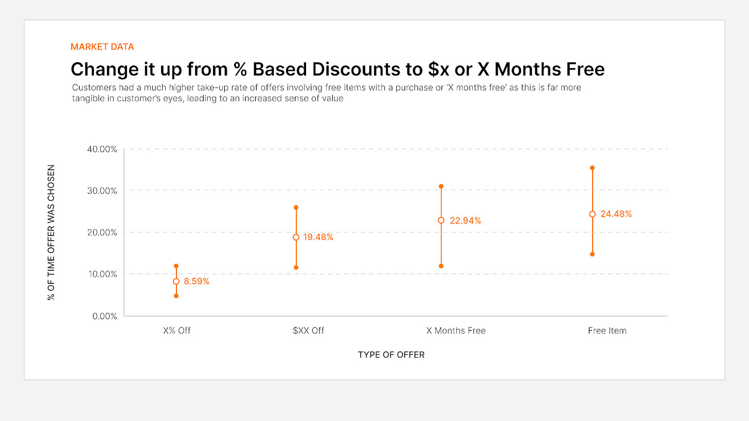
What’s easier to understand?
15% off $89/month or
Save $160
So instead of offering 20% off an annual plan if Gemini wants to increase the take-up rate of an annual plan they should either offer:
✅ 2 Months Free
✅ Save $40 per year
The devil is in the defaults, so whenever a user goes to the pricing page they should see the annual plans, not the monthly plans. It increases conversions to annual and makes it seem like better value as per month it is a lower cost.
3) Put The Most Expensive Tier on the Left
It’s difficult to quantify the value of a digital product. Should this database be worth $10 or $10,000?
This phenomenon is even more difficult in the age of AI. How are we meant to quantify the value of a tool that can do a research task that would take a human 15 hours?
That’s why the best pricing is all about framing.
If you show your users the most expensive tier first, our monkey brains associate that as a baseline cost. What most companies do is make the first tier the cheapest, but this has the unintended consequence of making more expensive tiers seem really unaffordable.
The tactic can be reversed however. Show the most expensive tier on the left, and frame the value of Gemini at $200/month so when users then see a $20/month plan it seems so much more affordable.

What does all this look like together?
Wrapped: A Redesigned Gemini Pricing Page
