


Analysing Notion’s Checkout Flow
Why they changed their free plan

👋 Henry here, welcome to B2B Growth Insights, where I help get you smarter on B2B Saas growth, go-to-market and pricing.
Notion’s Pricing
Last week as I was in the airport I decided to sign up for Notion, for the third time.
I’ve never found it groundbreaking but the desire to find a piece of software that would better organise my notes hooked me once again.
This article looks at how Notion are achieving hypergrowth despite being in such a competitive market.
One thing that Notion has always been strong on is their freemium model. What differentiates their plan from other companies is that Notion’s free tier continues to become more generous whilst most others are gating featutes and raising prices to achieve faster growth.
Even back in 2019 their free plan gave users 1,000 blocks and access to all core features, heavily investing in a strategy of subsidising individuals to develop champions who bring it into their companies so they can sell an enterprise package.
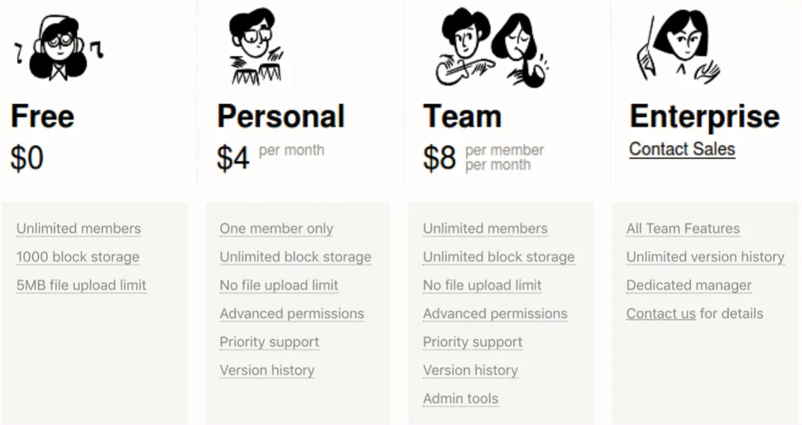
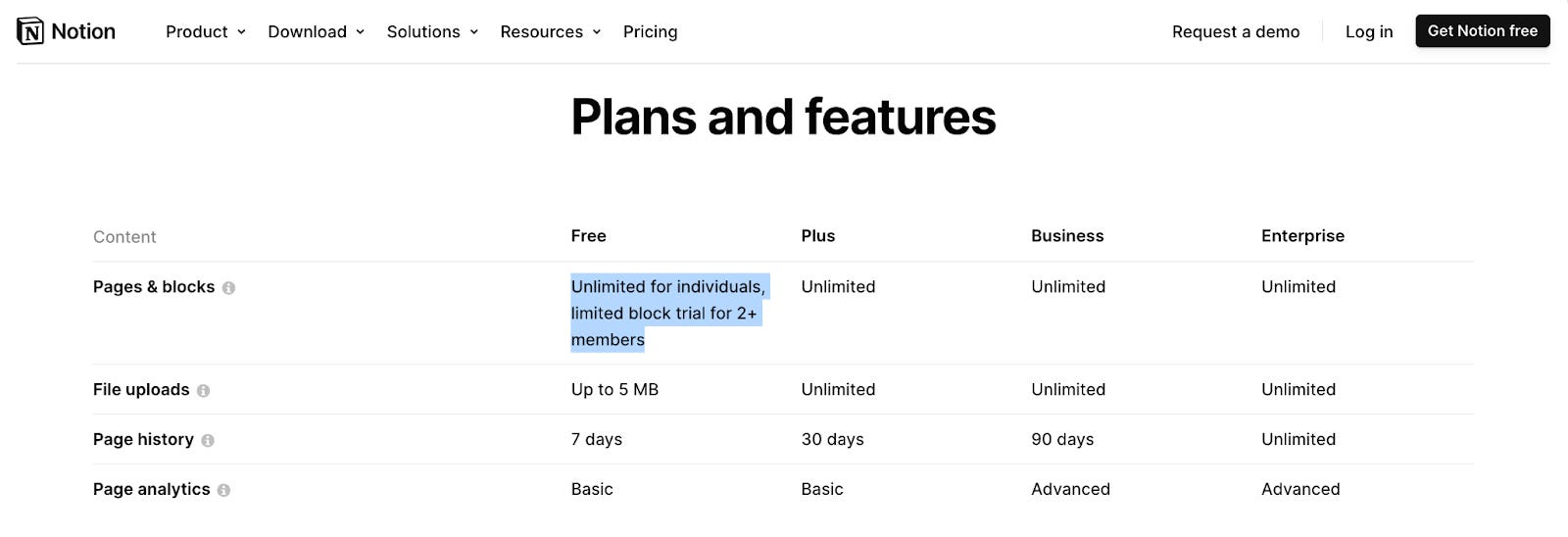
But their free plan has continued to evolve, where what used to be their $4 per month tier, is available for free - removing a limit on blocks.
This new approach has a couple of benefits, but also drawbacks:
✅ Freemium = Reduced CAC: By giving away core functionality it gets more people in the product, to later upsell them on team plans or add-on features like Notion AI.
✅ Minimal Restriction on Adoption: By removing the 1,000-block limit, Notion is removing any sort of barrier to getting started.
✅ Counterpositions Against Competitors: Notion is commoditising the individual subscriptions to create a larger user base for their team’s product where they have a better solution than the rest of the market.
❌ Revenue Cannibalisation: Anyone only using it for personal note taking now isn’t paying, they’ve cannibalised 100% of their single user accounts.
Notion’s Sign Up Flow
With users psyched seeing Notion’s generous free plan most will click through and be greeted by this sign-up page, asking for a user’s email.
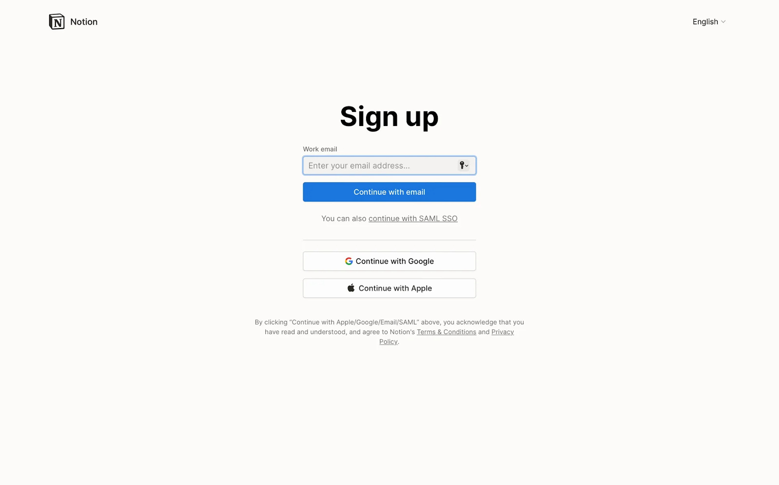
This is a pretty standard PLG motion, however, it’s not strictly the best optimised. Notion instead should be moving all the sign-up pages with the lowest completion rates to the end of onboarding (e.g. name & email), with high completion steps pushed to the start.
By putting “How are you planning to use Notion” at the start you increase sunk costs and have the opportunity to better personalise the rest of onboarding (e.g. Sign up to better keep track of meeting notes).
Notion’s Personalisation
Their next page, asking why you’re joining Notion, is great. It’s a beautifully simple page, with three clear ICPs: Teams, Personal Use, and Students, where the rest of onboarding is tailored to their needs.
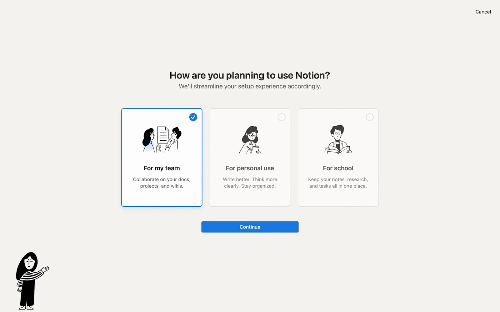
I decided to click through the team option to see how it would go. Instead of overcomplicating the page with fancy graphics they keep it minimalist so you don’t ever have an opportunity to lose focus.
You’d be surprised at how much overdesigning your sign up pages can hurt conversion.
One nice little touch? If your eyes do begin to wander they have a little Notion avatar guiding your eyes back to where your focus should be.
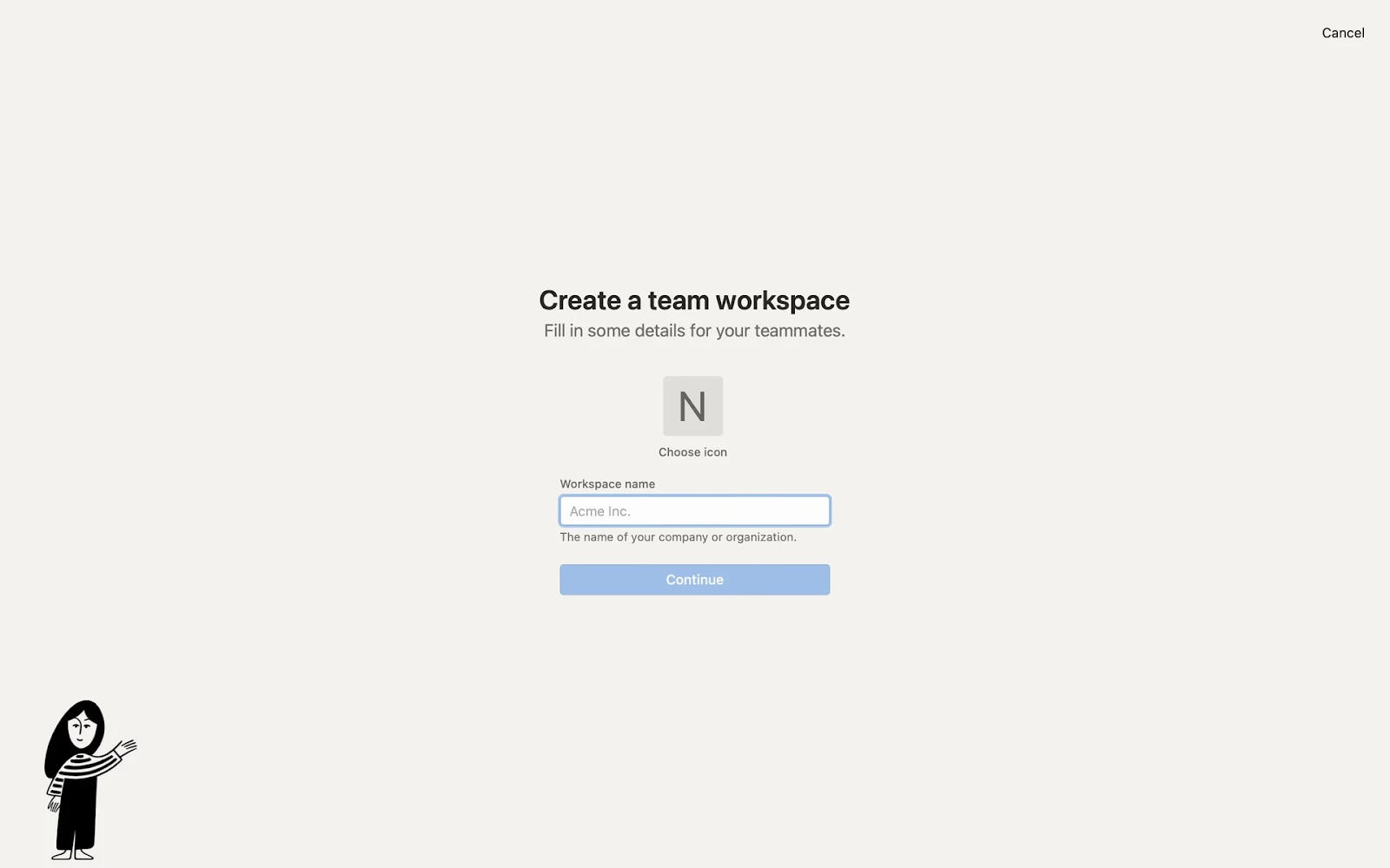
They then ask for the logical next step and a low commitment piece of information, the name of your team workspace.
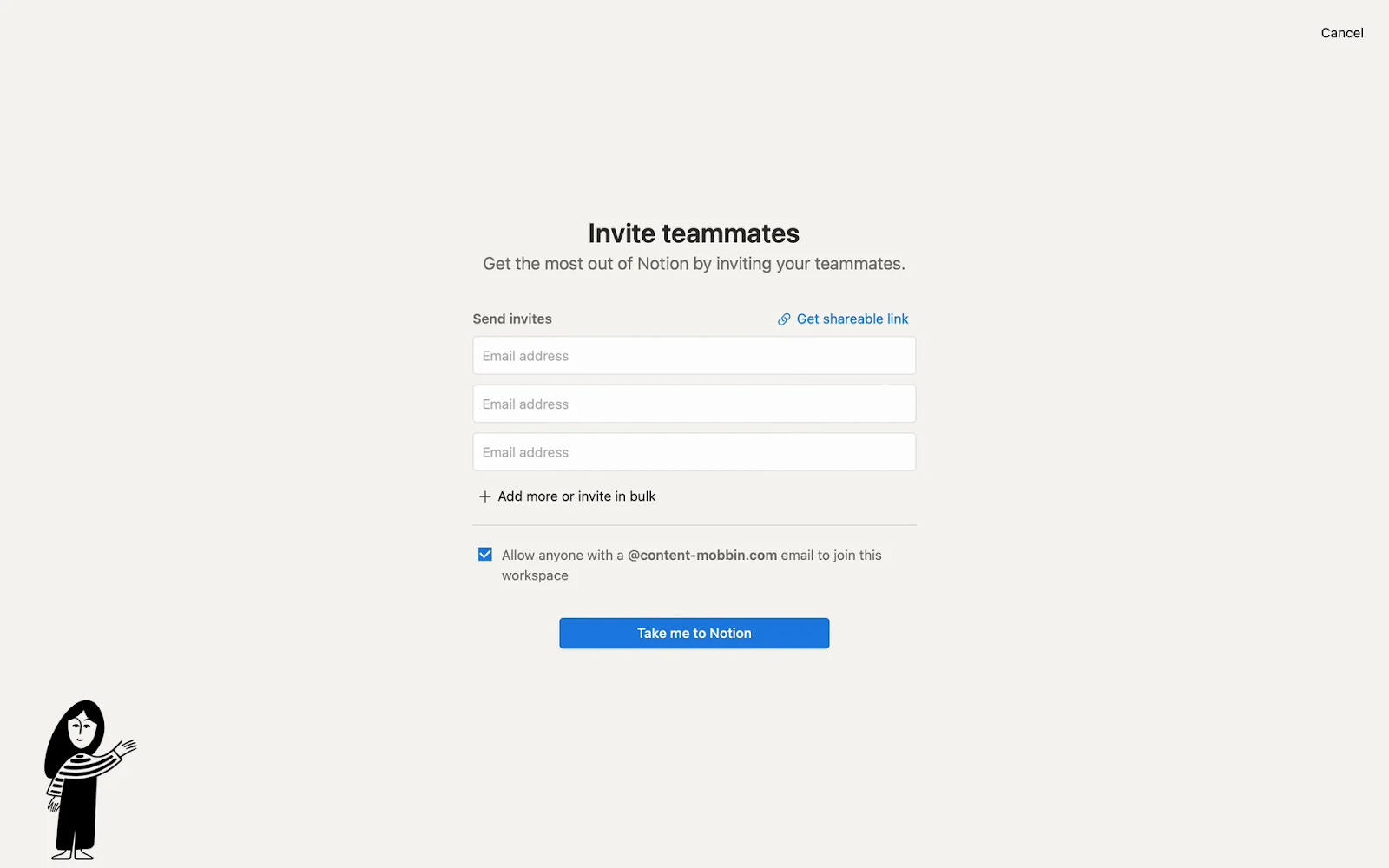
Next up is the big one, asking you to share with your teammates.
It’s great this is after a user names the workspace, because it enables far greater personalisation of the invite with an icon and workspace name, boosting conversion rates by 30+%.
Continuing from strength to strength we see a paywall for a free trial. Why is this important?
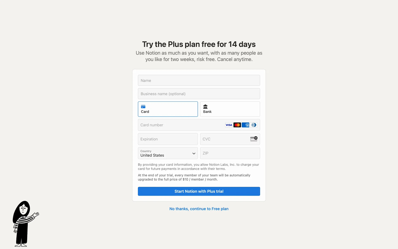
Whilst their plans are free for individuals and 10 guests, they monetise when you bring onboard collaborators.
It’s critical the share request is before the paywall, increasing the likelihood of wider team adoption and thus a multi-seat account, but it’s still imperative to show a paywall in onboarding for a couple of reasons:
✅ Revenue Increases w/ Paywall Views: Surprisingly, revenue increases almost linearly to the number of paywalls shown. Start showing paywalls early when they are most excited to try out your product (when signing up) and no one has churned from the platform yet.
✅ Free Trials Create Urgency Better than Freemium: Whilst more complex products like a data warehouse benefit from longer free trial (e.g. 60 days) to set up workflows, for products with lower complexity shorter trials work best.
These shorter trials increase urgency and force users to try your product now, whilst still giving enough time to migrate over docs to build switching costs.
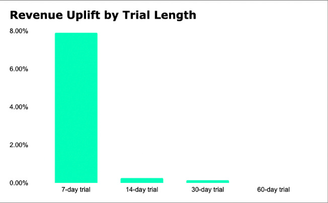
❌ Experiment with 7 Day Trial: However, it’s likely a 7-day free trial would be even more effective. A Uni of Washington study of 337,724 users saw 7-day trials outperformed:
7-day trials increased:
Subscriptions by 5.59%
Retention by 6.4%
Revenue by 7.91%
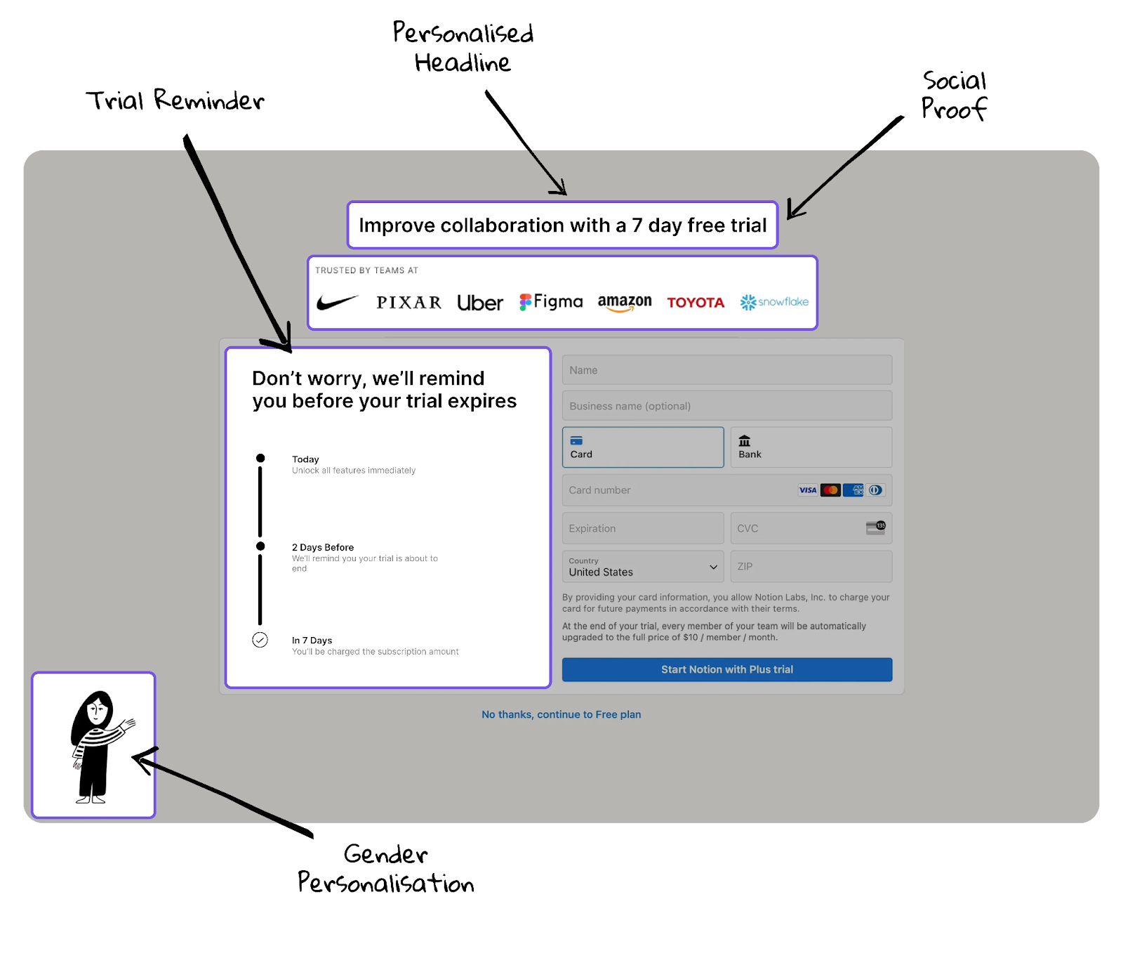
❌ No Social Proof: Despite the fact their pricing page shows off some great customers their paywall is missing any form of social proof.
❌ Trial Expiry Reminder: Users don’t love trials with credit cards because they’re afraid they’ll forget to cancel. Copy Blinkist and ease their fears by letting them know they’ll receive a reminder beforehand.
❌ Lack of Personalisation: Notion is a very horizontal product with loads of different use cases. Try and figure these out in onboarding to better personalise the paywall to their goals.
Suggestion #1 - Increase Paywall Conversion
Aside from the pointers listed above let’s take a dive into onboarding improvements. Perhaps counterintuively, Notion could look at actually lengthening their signup process.
Why?
This enables a couple of things:
Improved Setup Recommendations: Monday.com does this exceptionally well, asking for a decent amount of information which may cause drop off, but for the ones that complete onboarding they have a much better ability to recommend templates, increasing the % who activate.
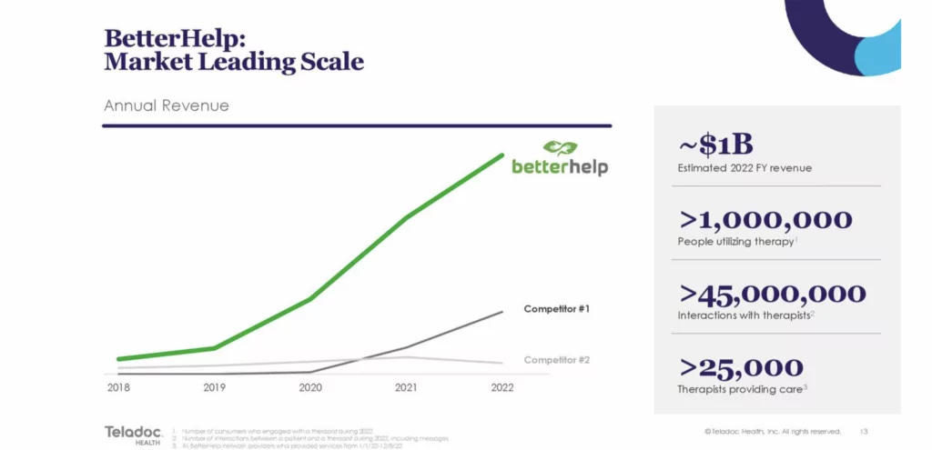
Better Visualises User’s Pain: BetterHelp is the master here with a 30+ question onboarding quiz digging into the pain you’re looking to solve, thus increasing the perceived value of the product.
The results?
BetterHelp’s Quiz Funnel generated over $1 billion in 2022.
For Notion this could be simple personalisation of gender, or even more complex things like objectives/desires.
Here’s a concept for a new, and improved Notion paywall.
Suggestion #2 - Cart Abandonment Flow
To test what messaging I’d receive I opted to not input my credit card details. To my surprise, nothing.
Not a single email despite the fact I had demonstrated myself to be reasonably high intent but had churned right before payment.
This isn’t uncommon for SaaS, most companies don’t have any form of cart abandonment flows despite the fact 70% of buyers who add to cart or view a pricing page don’t end up converting.
As a result a well-built cart abandonment flow can be a pretty major boost to profitability and is something every successful e-commerce company has adopted to boost customer LTVs.
Not subscribed yet? Consider joining below for bi-weekly breakdowns of top SaaS companies.